Building a marketplace for product designers and companies.
Heymake helps U.S. product designers find relevant work, and helps companies find designers with the right experience.
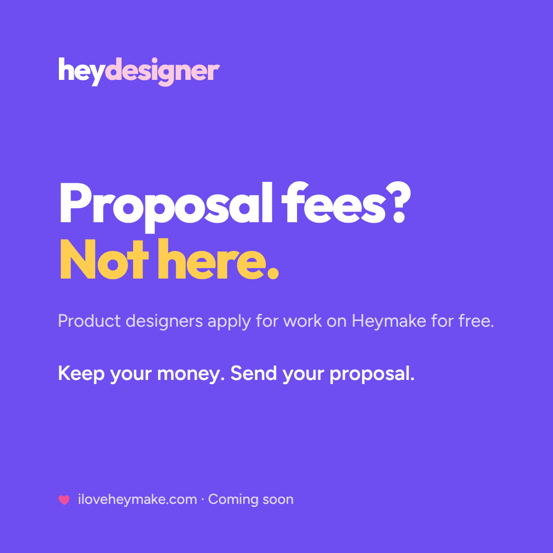
I started Heymake after seeing how hard it can be for designers to find credible product work. Proposal fees, paid visibility, unpaid design tests, questionable opportunities, and crowded applicant pools can make the search frustrating for designers and companies.
I wanted to build a marketplace for designers to find work, without making them pay just for the chance to earn. With so many services charging more at every step, keeping costs reasonable is part of the idea from the start.
I compared the marketplaces designers already use.
Heymake grew from firsthand frustration with marketplaces that do not work fairly for either side. Companies face overwhelming applicant pools, inflated experience and inconsistent standards, while qualified U.S. designers compete against rates shaped by entirely different economies, pay excessive fees to apply and gain visibility, and are often ignored or asked to work for free.
To understand what was and wasn't working, I researched Upwork, Braintrust, Toptal, Fiverr, A.Team, various recruiters, etc., using many of them firsthand. I looked at how each one handles applications, fees, visibility, and hiring, and who ends up paying for it.
| Platform | Freelancer pays | Client pays | Who funds it |
|---|---|---|---|
| Upwork | $19.99/mo to apply, then 0-15% of earnings | Free to post, up to 7.99% on payments | Mostly the freelancer |
| Fiverr | 20% of earnings | Free to browse, then 5.5% plus a fee | Mostly the freelancer |
| Toptal | Nothing (markup not disclosed) | Roughly double the rate, deposit up front | The client |
| Staffing agencies | Nothing directly | 25-60% on top, for the life of the contract | The client |
| Recruiters (full-time) | Nothing | 15-25% of the first year's salary | The client |
| LinkedIn & job boards | Free to apply | Cheap to post | The client |
| A.Team | Not published | Not published, one all-in rate | Not published |
| Braintrust | Free, 0% of earnings | Reported 10-15% on top of the rate | The client |
| Contra | Free, 0% of earnings | $29 a contract, plus card costs | Neither, really |
A focused marketplace where serious clients find experienced designers.
My goal was to build a focused marketplace for two groups only: product designers, and the clients with real product work for them. On the marketplaces I use every day, and others I researched, product work was mixed in with logo projects, marketing sites, and other unrelated creative services. Vague postings and poor matches clogged the feed with irrelevant work. Narrowing it to one discipline makes it easier for a U.S. product designer and a company with real product work to find one another, understand the fit, and start working together.
My hypothesis is that a smaller, focused marketplace, limited to U.S. product designers and U.S. product work, will create more value by reducing uncertainty and wasted effort for both sides.
Product design is just the start. Heymake is built to scale to other needs like development and motion in a future release, once the first version proves itself.
- Product design, only
- Designers aren't mixed in with logo projects, marketing sites, or other unrelated creative services.
- U.S. on both sides
- Designers compete within the same labor market, and clients know where the person doing the work is based.
- A manageable applicant pool
- Every posting has an applicant limit the client chooses. When it's reached, the posting closes, so designers aren't one of hundreds and clients aren't buried.
- Everything needed to judge fit is visible
- Rates, availability, experience, work samples, applicant count, and client responsiveness are all visible before applying or making contact.
- You always hear back
- A posting with no response closes, and every application shows where it stands: hired, declined, or closed. Never silence.
- Verified, factual experience
- Portfolio ownership, work history, LinkedIn, and U.S. location are checked, and experience is shown through real roles and outcomes, not a score or badge someone can buy.
- No paid priority
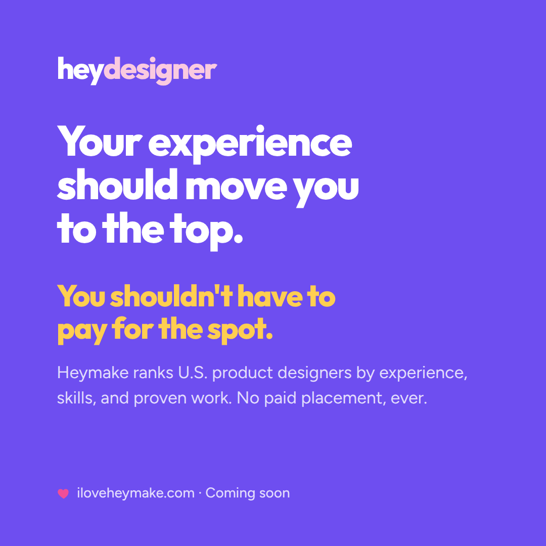
- No boosts, promoted profiles, sponsored listings, or placement determined by spend.
- No unpaid work
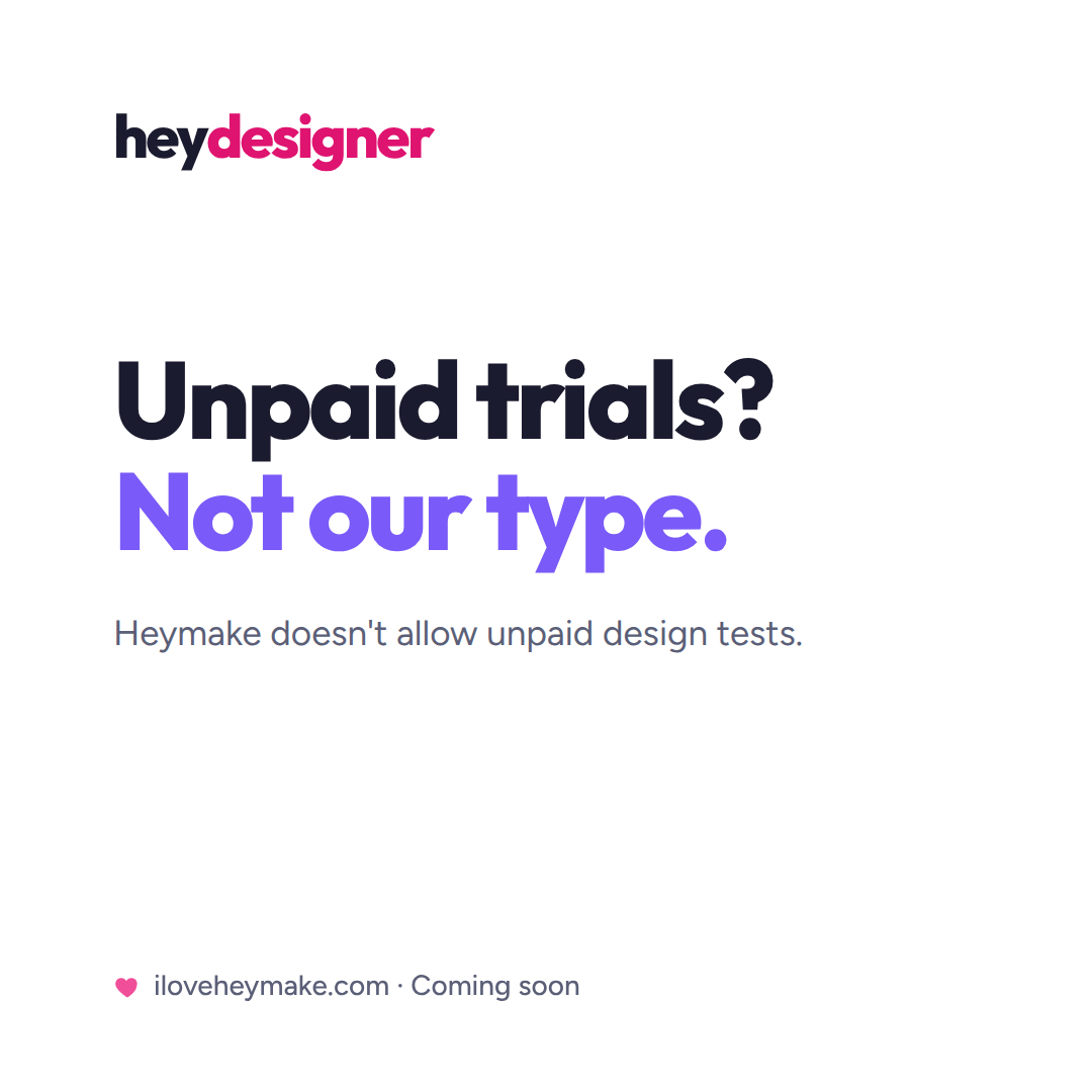
- No design challenges, speculative ideas, unpaid trials, or "send us something first" requests.
Building the foundation.
Branding
I started with the branding, and I treated every choice as a decision with a reason behind it. I wanted a name that was short and sweet, under seven characters, so it would be easy to say, read, remember, and reference. It had to feel positive and uplifting to set a friendly and casual tone.
That became Heymake, set as a two-tone wordmark. The word "hey" sets the tone for the brand, warm and conversational, and it was made to work across all types of messaging. The tagline pulls the message and the target market together in one line: "Hey, let's make great products."
Scalability is one of the main goals, and it starts with the branding. "hey" stays the same, while the second word swaps to fit each audience. The default brand is heymake, and it scales to heydesigner, heydeveloper, or heyclient. Each audience gets its own color, pink for designers, blue for developers, and green for clients, carried through the logo and the rest of the application. The pattern stays the same, so the brand can reach a new audience without a redesign.
Design system
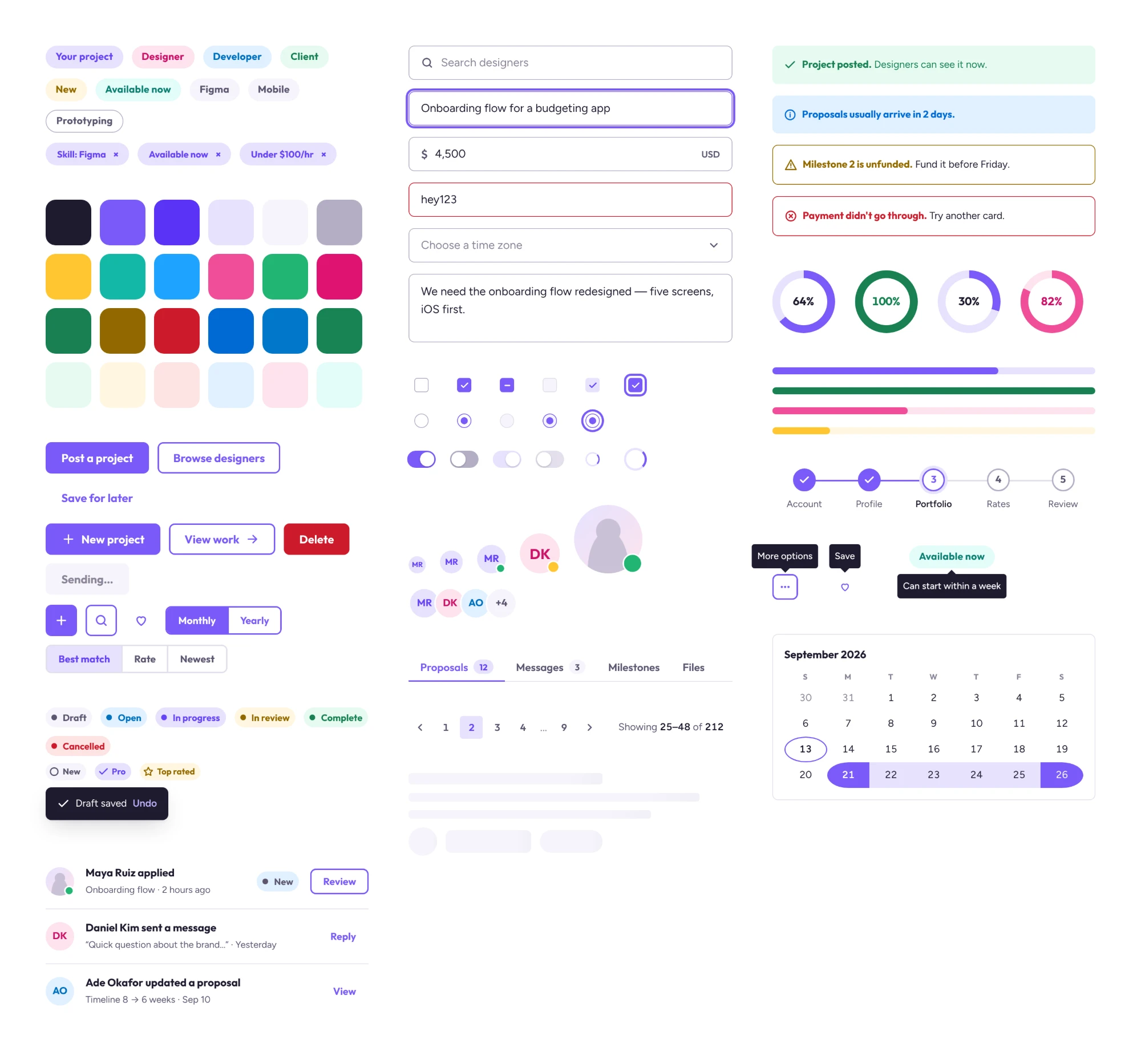
The design system defines one visual family across every touchpoint: the web app, the mobile app, the marketing, and the admin views. Colors, type, spacing, and a full component library live as reusable tokens, so everything stays consistent and fast to build as Heymake grows.
Validating the problem before building.
Before building the product, I wanted to prove this is a real problem worth solving. So I set out to gather genuine interest and feedback from designers and companies first.
Social channels
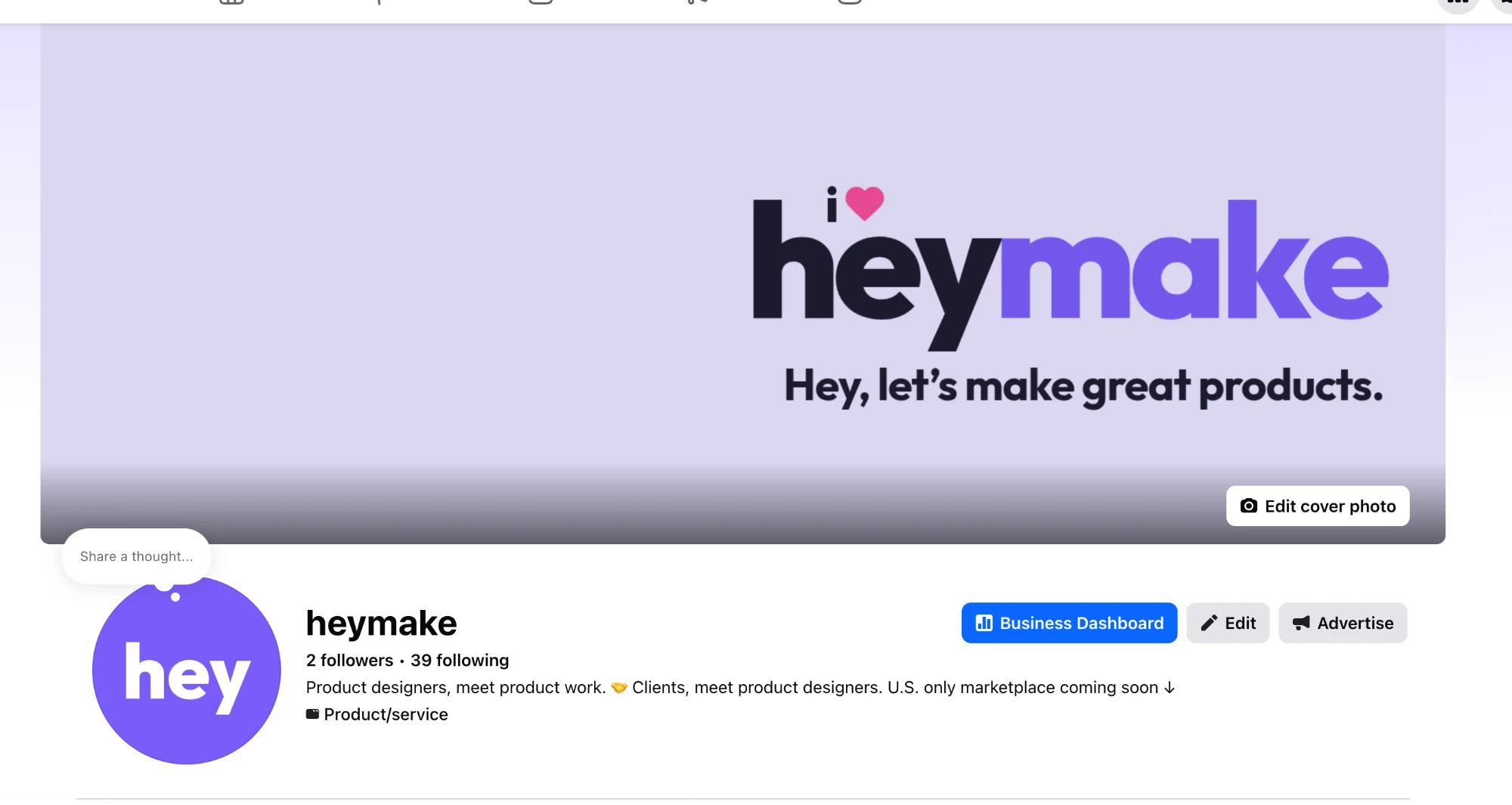
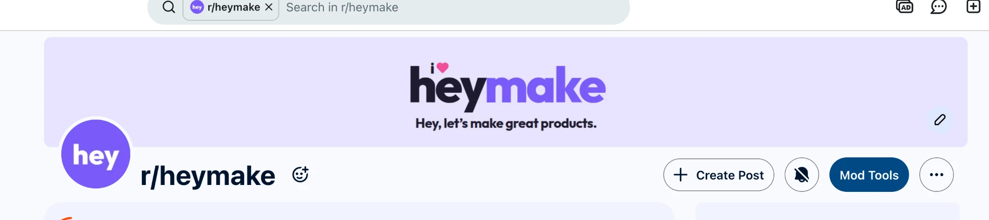
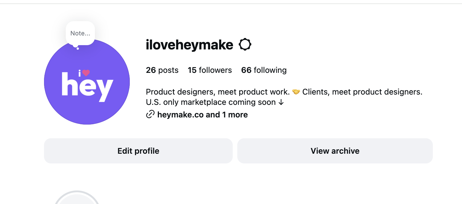
I set up Heymake on LinkedIn, Instagram, Facebook, and Reddit to get the word out, spread awareness, and talk with the community. Everything is organic for now, nothing paid: I post content and comment on relevant posts, all pointing to the homepage.
Marketing
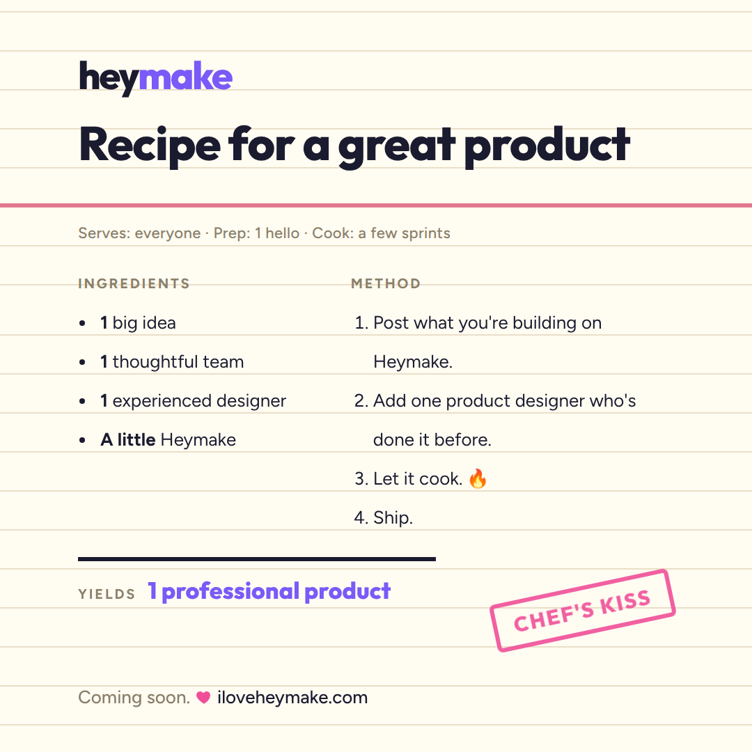
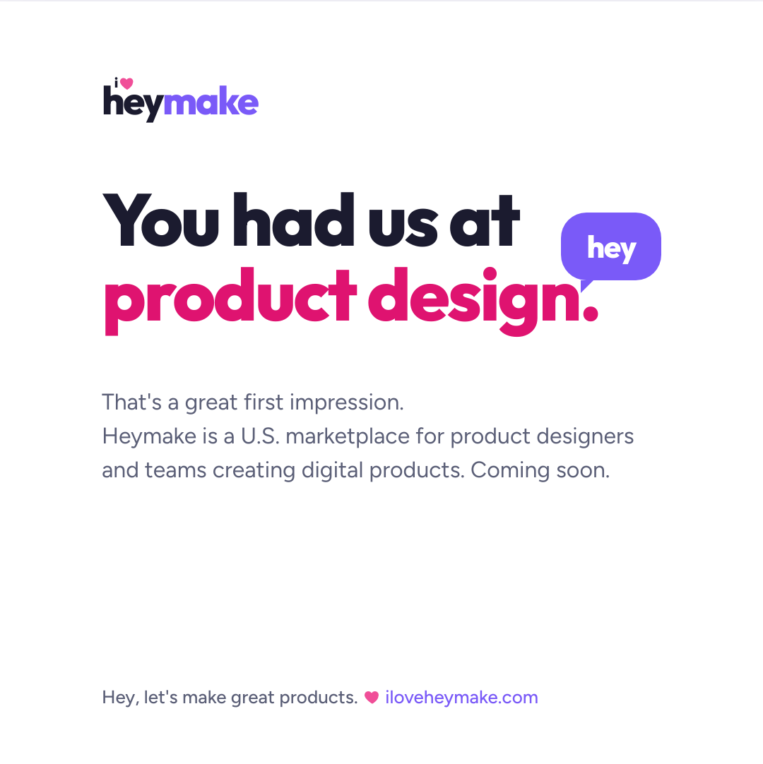
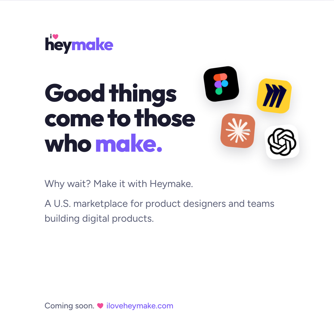
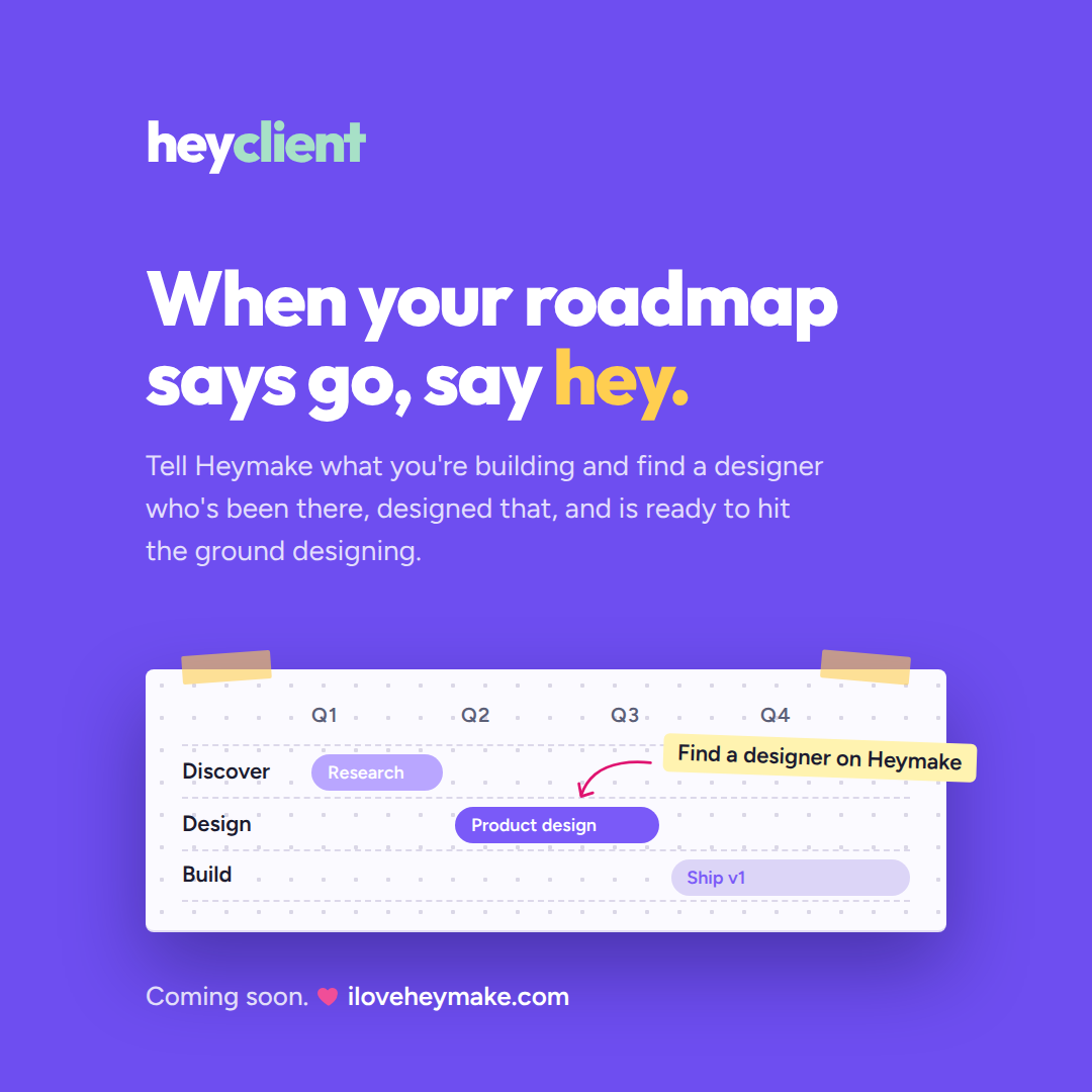
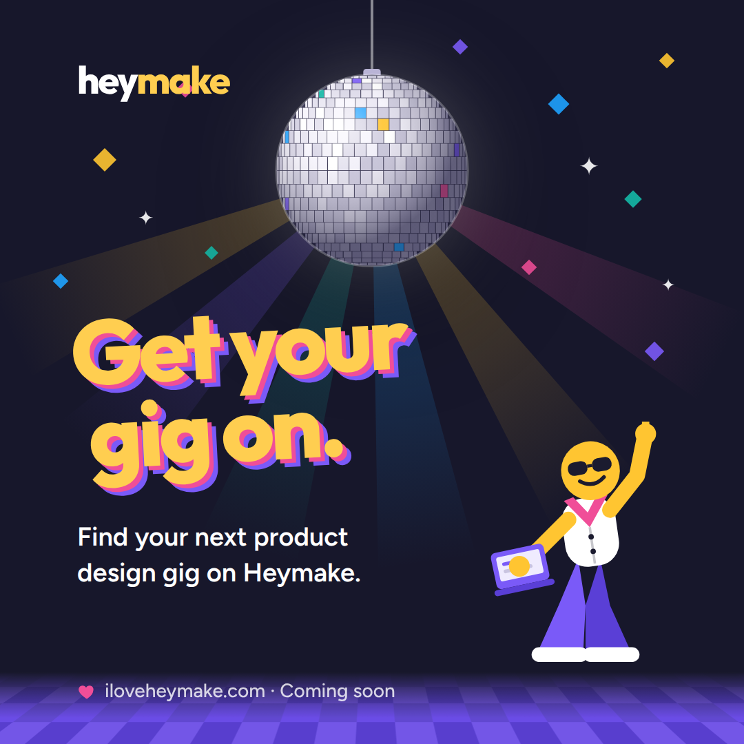
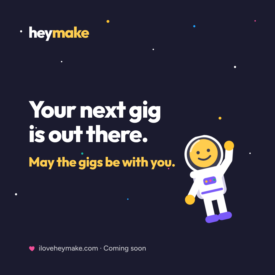
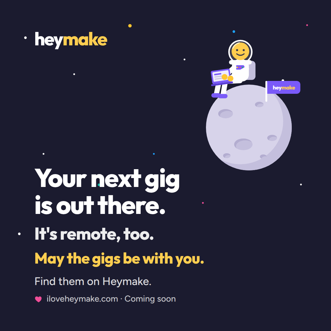
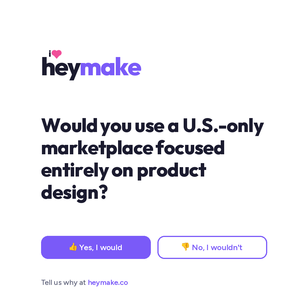
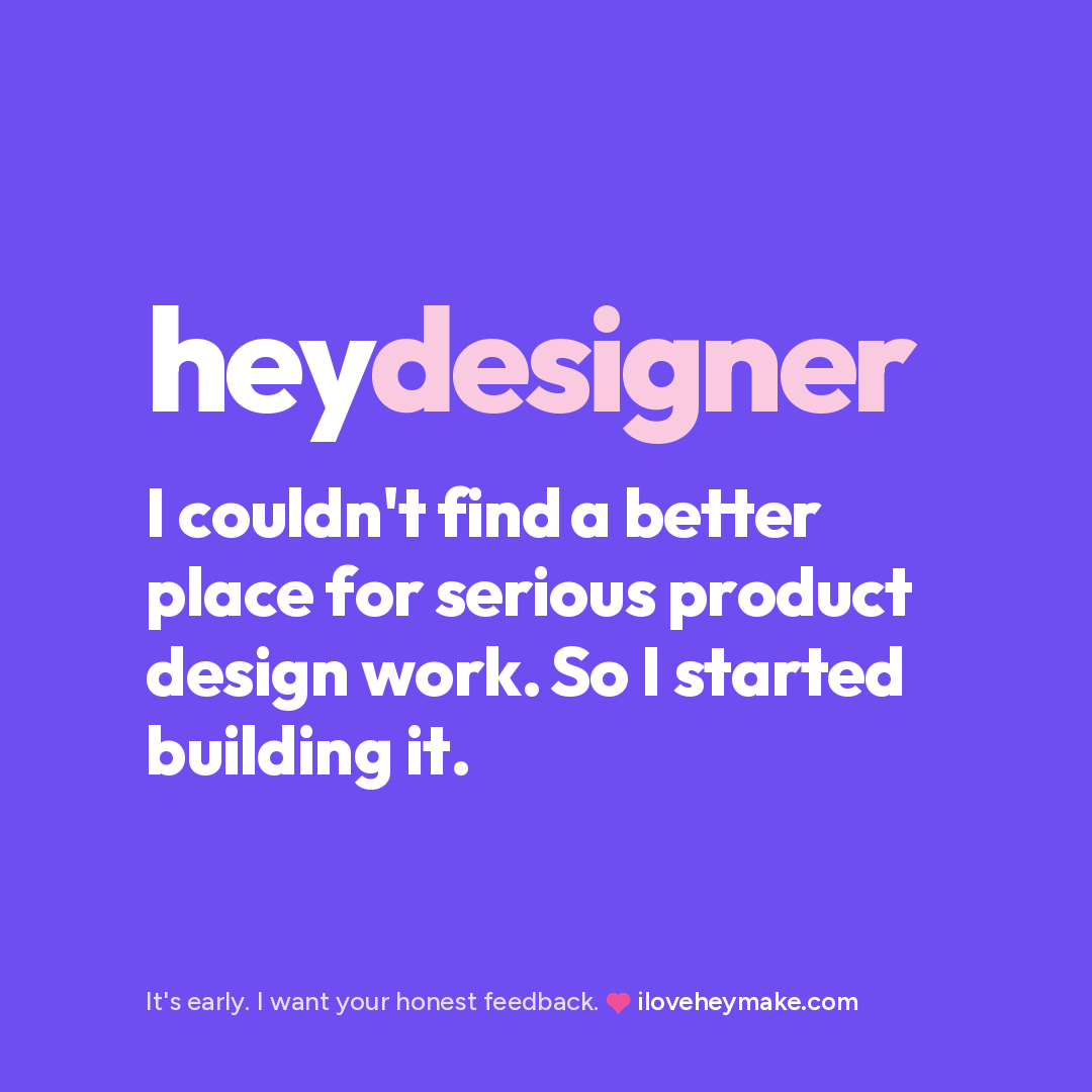
I designed a set of ads to run across those channels, each built around a problem designers and companies recognize.
Homepage
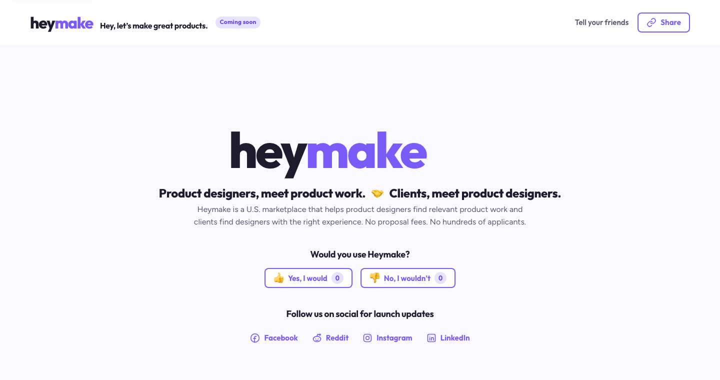
Every channel and ad points to the homepage, where visitors react with a quick yes or no, leave feedback on whether they would use Heymake, and share which features they would like to see.
Analytics and Slack integration
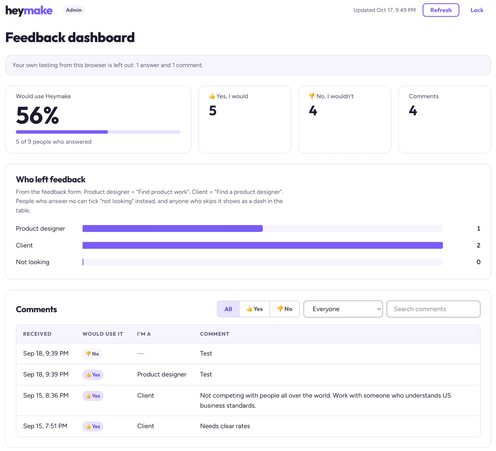
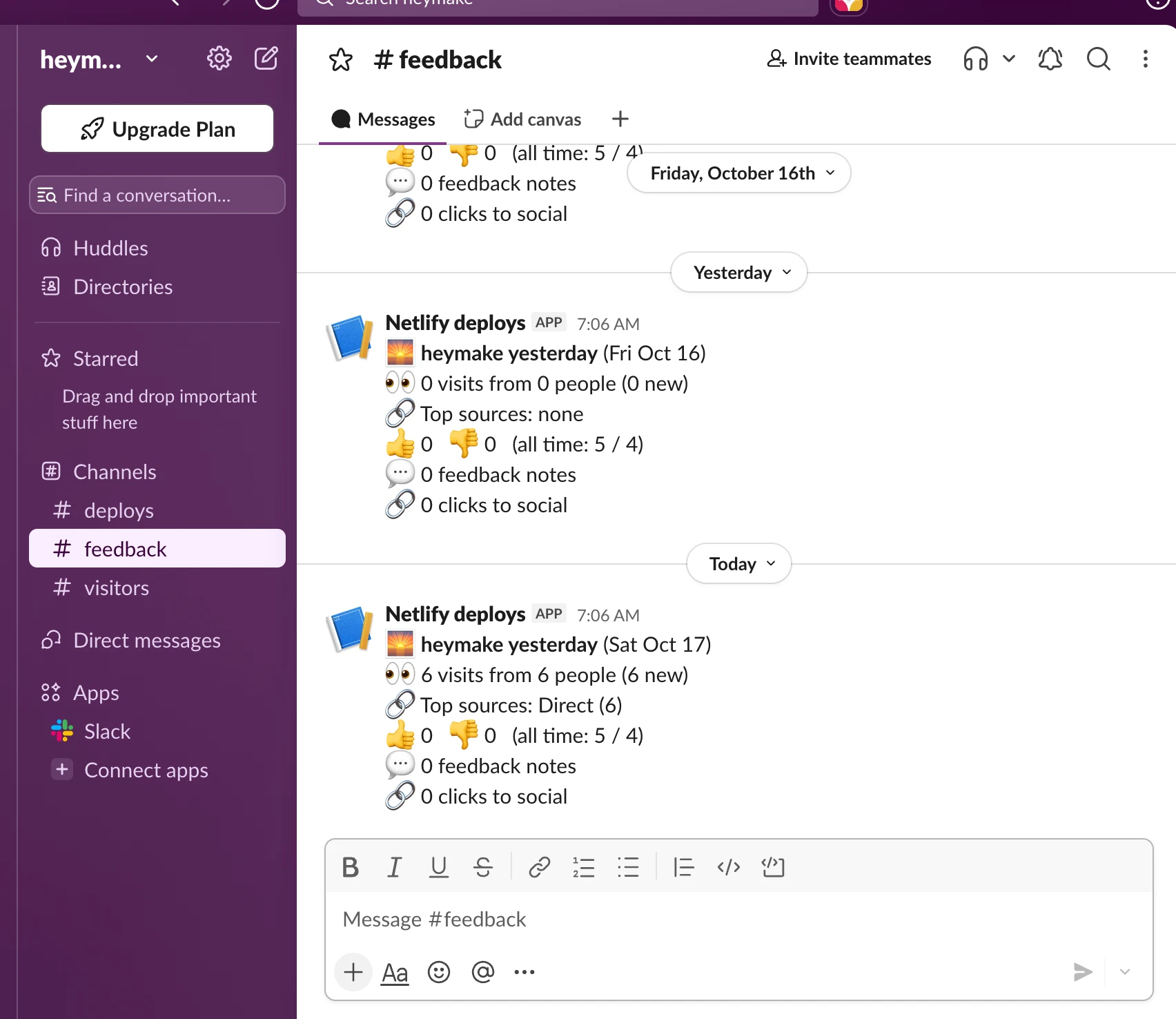
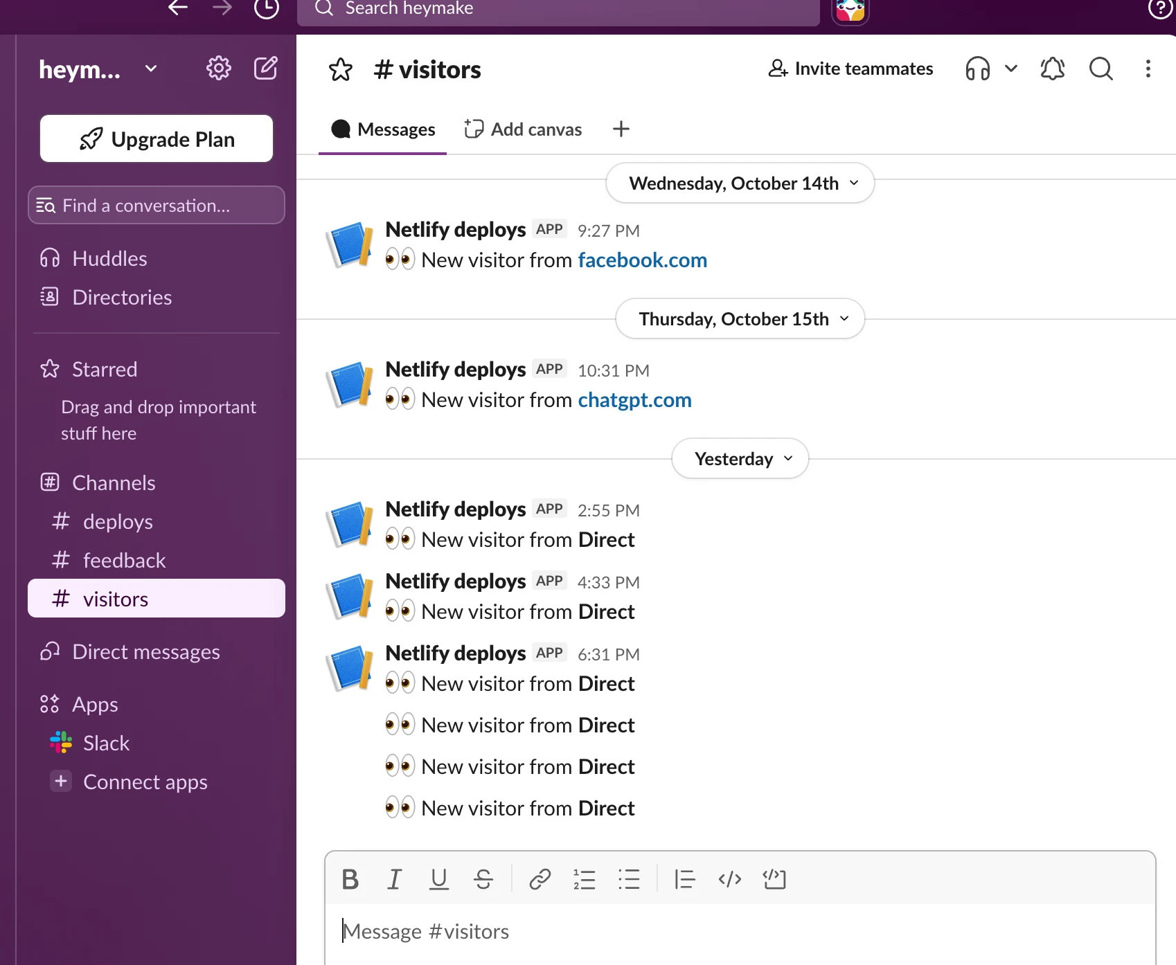
To see what was happening, I added analytics through Microsoft Clarity, built a database to track the feedback, and designed a UI admin dashboard to read it. I also created a Slack channel with a real-time integration, so new visits and feedback come through the moment they happen.
A soft launch of the application, coming soon.
The application is coming soon in a soft launch. Before opening it up, I want to run more detailed validation, including paid ads and deeper social integration, so the product meets real demand when it goes live.
Ownership
- Lived the problem myself, heard it from other designers, and turned it into Heymake
- Developed the business model
- Built the validation strategy, the ad campaign, and a live site to test demand
- Created the brand, design system, and site architecture
- Built the admin dashboard, tracking database, and Slack integrations
- Chose the tech stack and designed and built the product, from business to build
Platform Highlights
- Focused on U.S. based product designers and companies
- A new marketplace that connects designers with digital product work
- Matches clients with a manageable pool of designers who have relevant experience
- Tracks feedback and real-time visits through site analytics and Slack integration